Rohner Letterpress and 50,000 Feet, Inc at the Art Directors Club Awards Exhibition.
The ADC Annual Awards, whose winning selections are on display at Columbia College Chicago’s A+D Gallery, honor a wide range of images and objects. From Penguin’s book about Penguin to clever print ads for Ikea to lenticular printing for book stores trying to lure children into the stacks, it’s hard to get bored looking at this year’s selections.
My favorite selection from the exhibition: the 2010 Rohner Letterpress promotional packet. Entitled “Wowza,” it is a paper packet containing information about the company as well as examples of what, precisely, a letterpress company can do. While it fits into the palm of your hand, big things await inside the packet–fifteen cards of bigness, in fact.
A company called 50,000 Feet, Inc. helped with the design of both the exterior packet and the cards inside. This collaboration allows Rohner to demonstrate why letterpress and other special printing techniques are still relevant, even desirable, in the digital age. Beautiful to the eye and exciting to the fingers, it is no accident that these cards fit in the hand and feature fairly clean visuals–you can take them where you will and spend as much or as little time as you like enjoying them. The variety of type faces, colors, weights, and textures begs to be examined and handled again and again–what keyboard, LED display, or billboard offers that?
“Peck” is one example of this. In addition to a surface simulating wood grain, it features holes punched into the paper, a delightfully literal interpretation of the text. Much lighter than a real slice of tree and probably more eco-friendly, this example shows how letterpress and other tactile printing methods can be as edgy and contemporary as any other design option, freeing them from the notion some may have of them as something old, stodgy, formal, and exclusively the domain of wedding invitations. When shuffling through the cards in the Rohner “deck,” the viewer also gets a peek at the next card through the holes in this piece, perhaps a bright flash of color or a glimpse of soft, decadent paper stock. “Peck” looks fun, easy, accessible, and contemporary, perfect for many of today’s print projects.
Of course, some people will always enjoy letterpress precisely for its vintage charm. A window to design of days gone by, nothing evokes timeless luxury and class like an ornate letterpress object. “Ooh La La,” a card featuring just such a design, stands in stark contrast to “Peck,” yet Rohner produced them both. The shimmery stock of “Ooh La La,” its thick “touch me” font, and its opulent swirls would make it equally at home in your grandmother’s parlor or in an edgy ad for an upscale shopping center. The versatility and visual/tactile interplay of these traditional printing methods make it easy to believe Rohner’s work has a place at the table next to the inferior yet ubiquitous internet pop-up ads, flimsy magazine inserts, and flashy TV commercials.
For more information, try For Print Only, 50,000 Feet, or Rohner’s web site.
Chicago Manual of Style, 1906 Edition…plus, fast cars.
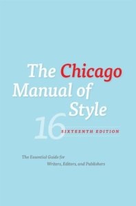
I have great news for sticklers and rule-minders everywhere. The Chicago Manual of Style has released its latest edition! Better still, they’ve made a PDF of the original 1906 edition available on their web site. It includes an exciting little section called, “Specimins of Types in Use.” Now you can get your nerd on with examples of vintage fonts and typography. Another interesting feature: the original CMS had pink accents, just like the current ones do. Apparently, including the color pink has a long and storied tradition at the U of C. Hopefully, they will upload other past editions, allowing fans to see how their use of this color has changed over the past 100+ years.
While most of the latest changes pertain to electronic documents, there are also what they call “significant rule changes,” including the way titles are punctuated, pluralization within quotation marks, and using compound words of which colors are a part. Plus, the titles of art exhibitions are now italicized. I suspect that the manual no longer features a section on type, since the number and kinds of fonts today, as well as trademark law, would make such a chapter larger than the rest of the manual and expensive to execute.
For those looking for something a little faster, perhaps more exciting, check out Ian Merritt’s photos comparing two models of Mercedes Benz automobiles. One is old, the other new, and this photo set for a car blog shows off such details as the silhouette of the open gull wing doors, the stitching on the seats, and all the good stuff underneath the hood. The subtlety of the older model remains appealing, while the speedy look of the newer model entices. If any readers (do I have readers?!?) have ever been lucky enough to get behind the wheel of one of these, more information about the cabin and all the little buttons and levers inside would be greatly appreciated. I look forward to seeing other examples of Merritt’s work, as well.


